Client
Targus
Project
Light UX & UI - website functionality
Completed
2017
Overview
Targus creates accessories and cases that promote protection, ergonomics, security, cooling and universal power solutions, targus makes your mobile life easy.
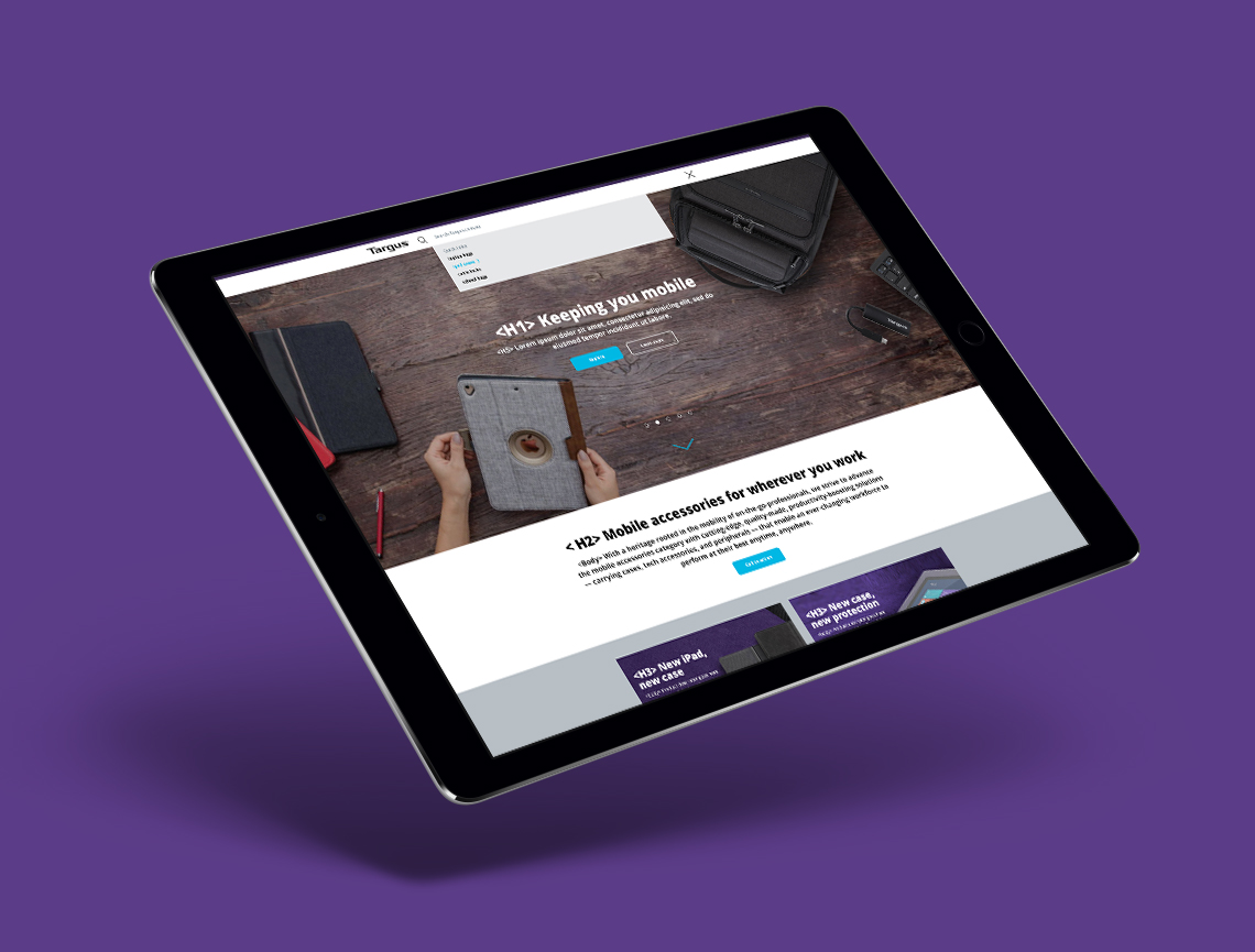
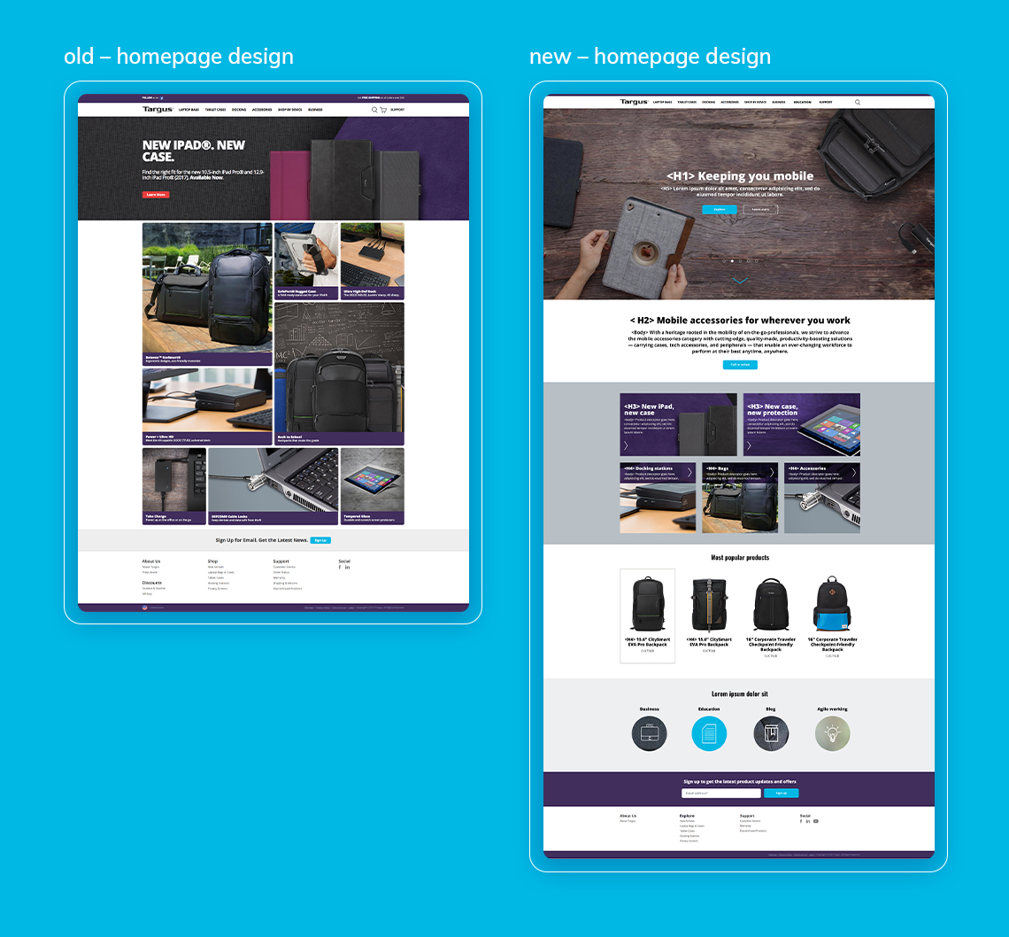
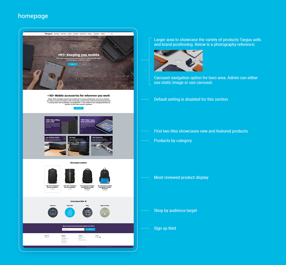
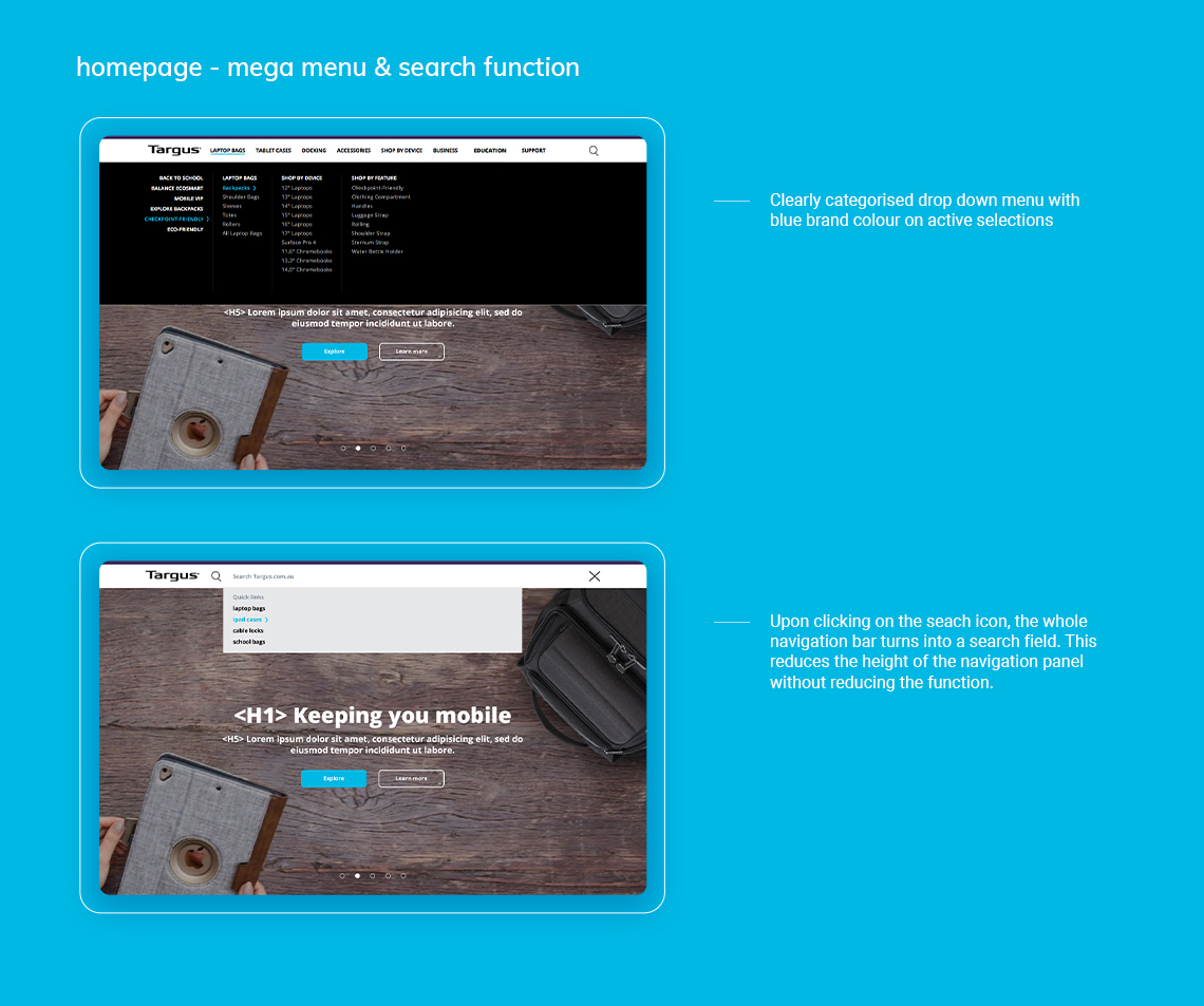
Challenge – homepage
Users should be able to:
- Find out more about what Targus offers at a glance
- Search products easily and clearly
- Browse through products and categories clearly
- Easily locate and click CTA buttons
- Stick to the old design system as much as possible
Recommendation
As most users already have a type of product in mind before visiting the website, a prominent display of a new iPad case is not going to affect this objective.
Therefore, the feature image space should be utilised to promote Targus offerings as a brand and distinguish itself from its competitors.
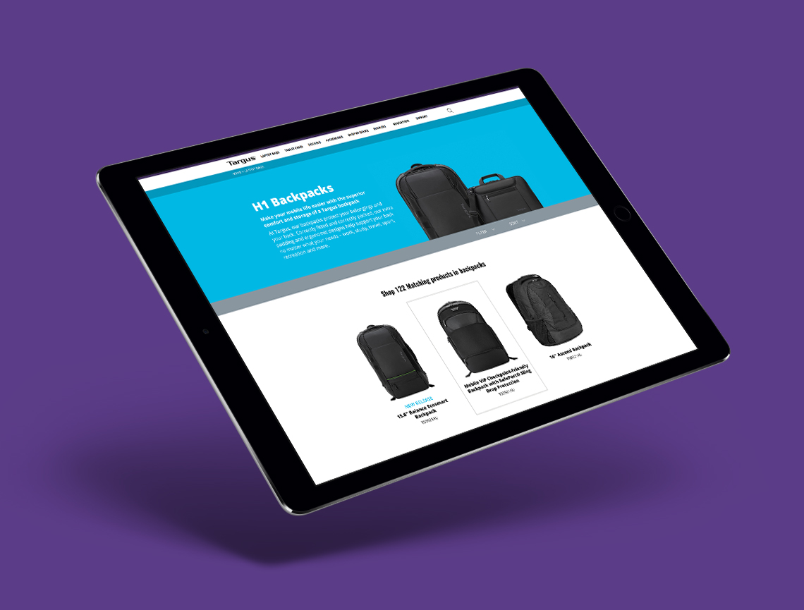
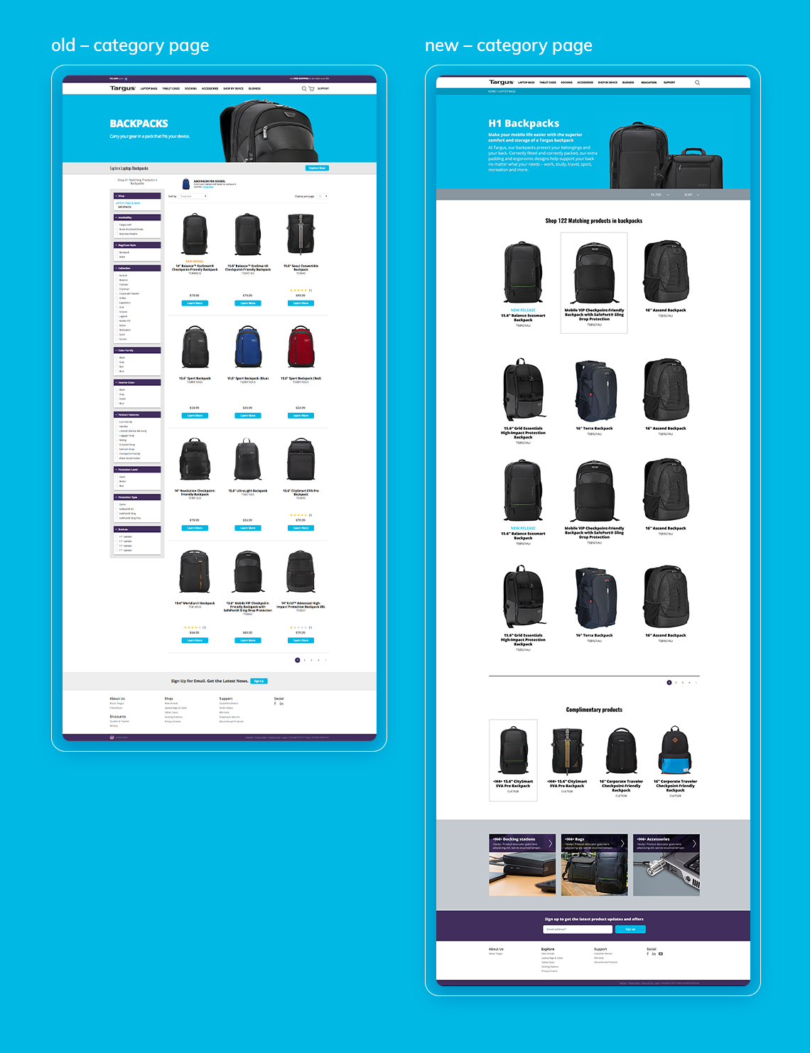
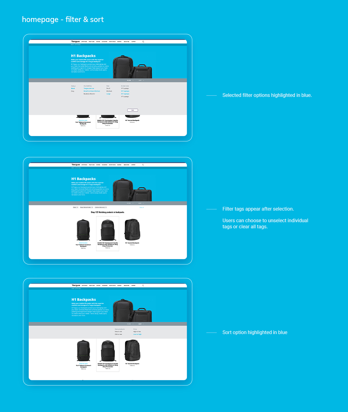
Challenge – category page
Users should be able to:
Browse easily and clearly
Filter and sort products efficiently
without occupying too much spaceGet suggestions if unsure
Recommendation
The current filter is taking up a quarter of the space and making the web page feel cluttered. By making the filter collapsible, it allows for the full page to be utilised.
Horizontal filter bar can also be available as the user scrolls by pinning it to the top of the page.
Each product image and its content are clickable without having to distract the user with buttons. A keyline selection indicates which product the user is hovering on, making the experience an intuitive one.

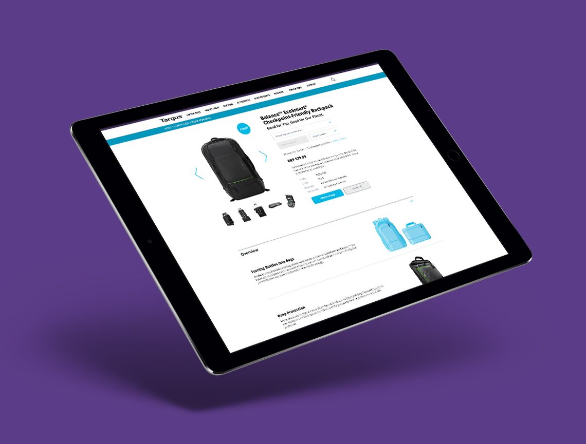
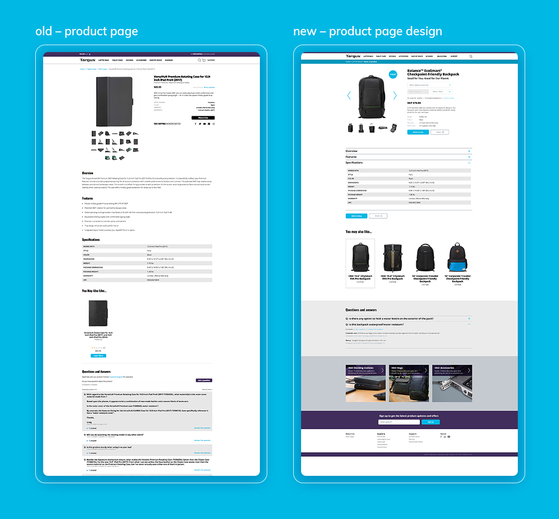
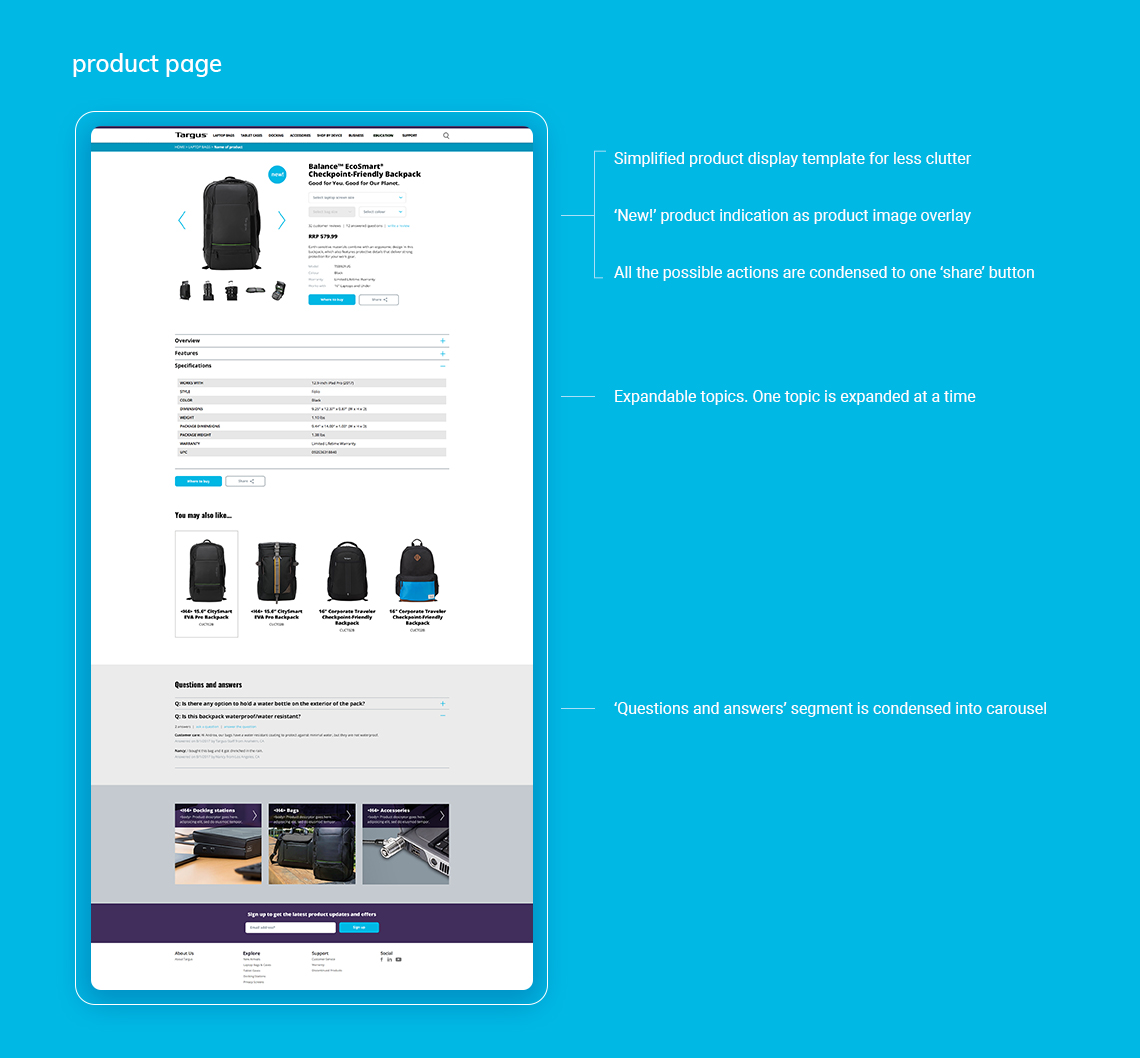
Challenge – product page
Users should be able to:
- Browse easily and clearly
- Clearly identify hierarchy of information
- Easily find where to buy or find out more about the products
Recommendation
By condensing the information into an expandable format, users are able to concentrate only on the information they need without being overwhelmed.
All the secondary action buttons are condensed into a single and less prominent ‘Share’ button to minimise distraction.
Conclusion
Due to time constraints, the research and consequent assumptions are based on my personal experience and a small amount of data. Deep analysis and additional testing needs to be conducted in order to refine and validate the solution.
Selected Works
TerraPizzasTake Home Test, Ecommerce, UX & UI
Benchmark GymUX Research + Usability Testing + Prototype
Hay (aspiring neobank) - work in progressMobile App, Product Design, UI & UX
Responsive Saas platform – light & dark Theme – work in progressDesign System, Dark & Light Mode, Logo
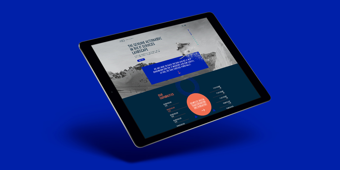
ASGLogo + Website
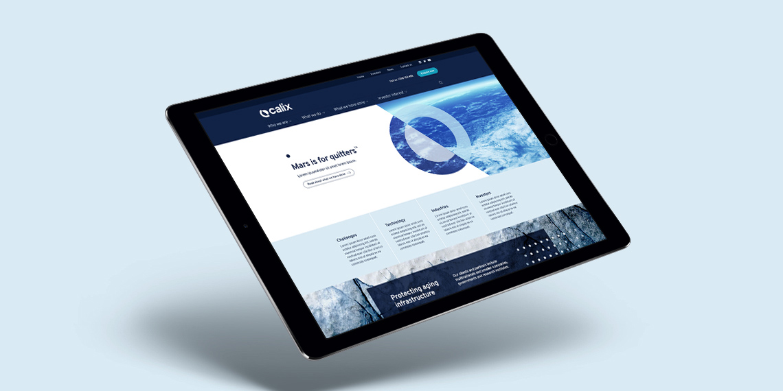
CalixLogo + Visual Identity + Website
PayrightLogo + Visual Identity + Campaign
HakoahVisual Identity
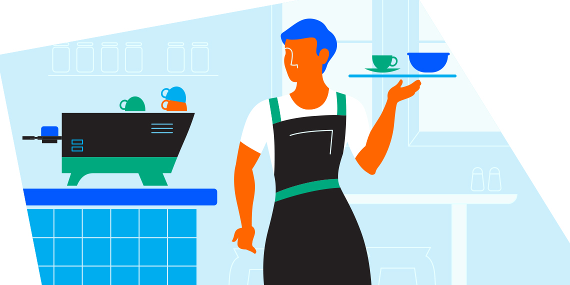
DeputyVisual Identity + Illustration
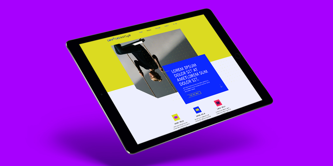
ImaginenationVisual Identity + Website
LogosLogotype & Logomark
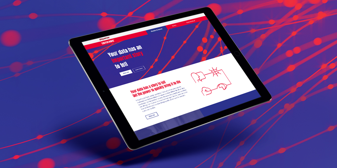
EquifaxWebsite, eDM, Visual Identity, Print
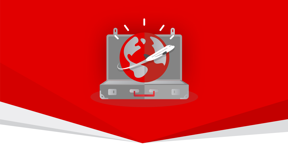
Vero – Qantas Business RewardsMini campaign

Vero - UI KitUI Kit
CatholicCare WollongongVisual Identity
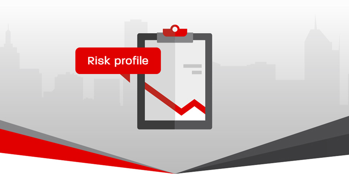
Vero – Risk Profiler ToolIconography, Digital Online Tool
All content © of the design agency and respective brands 2017-2020.