Client
CatholicCare Wollongong
Project
Campaignable Visual Identity
Completed
2019
Client
CatholicCare Wollongong
Project
Campaignable Visual Identity
Completed
2019
Overview
CatholicCare Wollongong offers a myriad of services from at home care to chaplaincy.
Overview
CatholicCare Wollongong offers a myriad of services from at home care to chaplaincy.
Overview
CatholicCare Wollongong offers a myriad of services from at home care to chaplaincy.
Overview
CatholicCare Wollongong offers a myriad of services from at home care to chaplaincy.
Challenge
CatholicCare Wollongong (CCW) is would like to refresh their brand to help drive brand awareness and reach more people in need. The challenge was to create a brand that focuses on the positives without neglecting the hardship that the target audience is going through. The brand has to also feel warm, open but grounded at the same time.
Execution
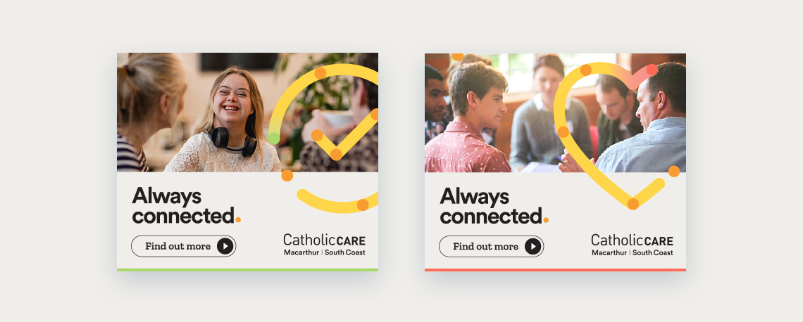
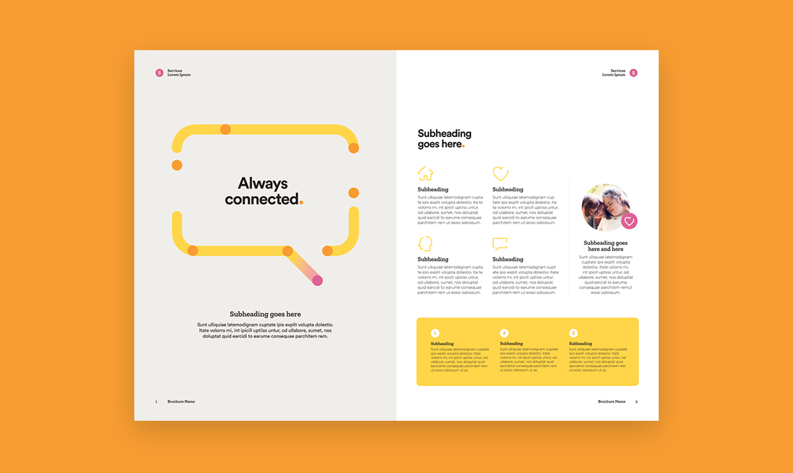
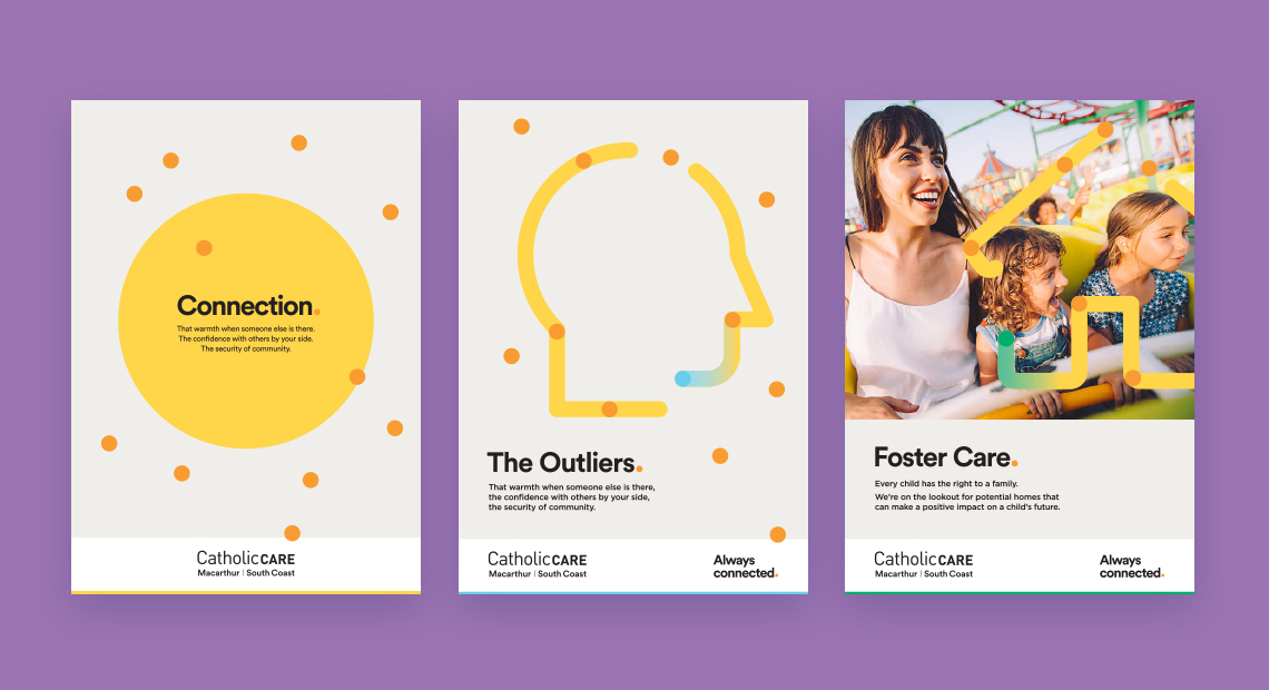
Inspired by the path that one takes in life and how CCW help connect the dots no matter at which point they are in life.
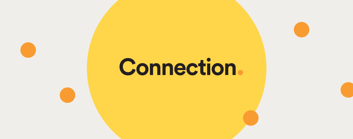
The primary colours are yellow and orange. They exude warmth and joy to help bring out the positive outlook of the brand. The different icons and their respective colours help categorise and showcase the different service offerings that CCW offers.
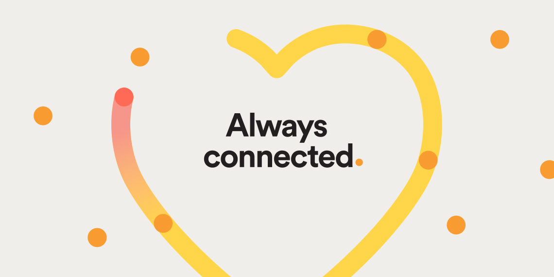
One of the things I learnt throughout creating this visual identity is to walk the fine line with the dot element that I used. A few more dots and the layout looks to busy.
The potential issue was solved by creating some prescriptive ground rules around the usage of the dots in conjunction with other elements such as line, photography and the larger circle, definitely help maintain integrity of the brand look and feel.
One of the things I learnt throughout creating this visual identity is to walk the fine line with the dot element that I used. A few more dots and the layout looks to busy.
The potential issue was solved by creating some prescriptive ground rules around the usage of the dots in conjunction with other elements such as the line, photography and the larger circle, definitely help maintain integrity of the brand look and feel.
Overall, the client was really happy and I am confident that the brand will roll-out well given the guidelines around usage.
Designing for CCW was a fulfilling break from working on corporate, insurance or technology related brands and I'm glad to be able to contribute to such a great service in a creative way.
Selected Works
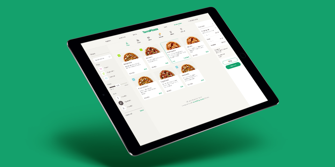
TerraPizzasTake Home Test, Ecommerce, UX & UI
Benchmark GymUX Research + Usability Testing + Prototype
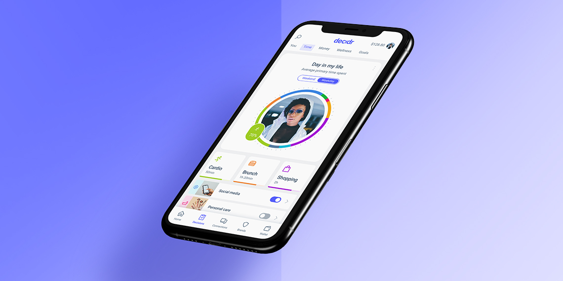
Hay (aspiring neobank) - work in progressMobile App, Product Design, UI & UX
Responsive Saas platform – light & dark Theme – work in progressDesign System, Dark & Light Mode, Logo
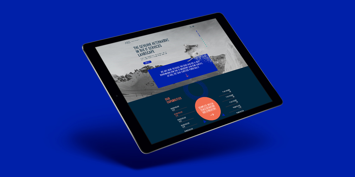
ASGLogo + Website
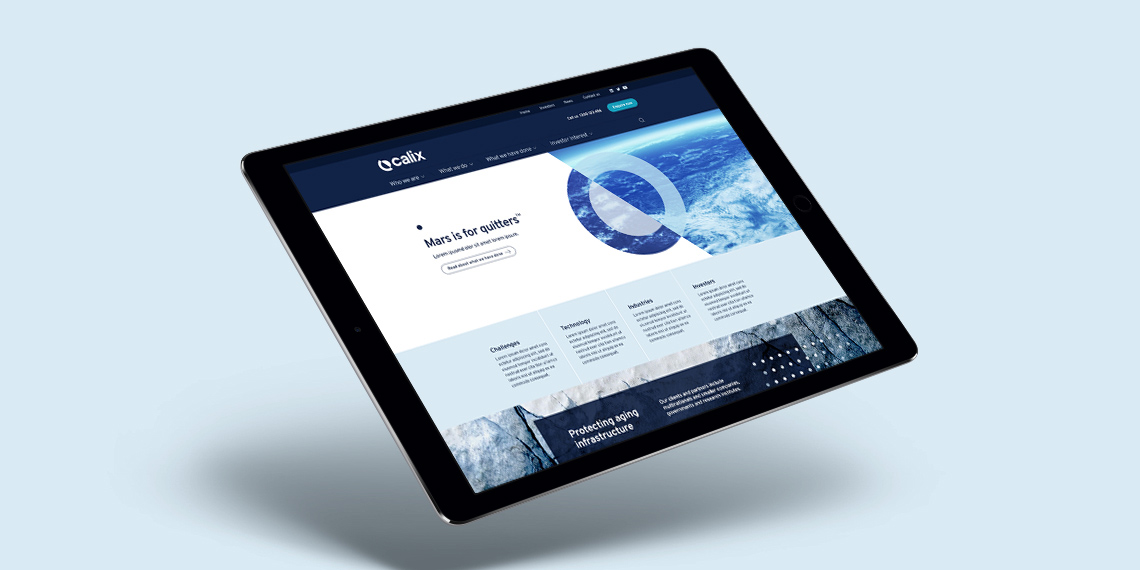
CalixLogo + Visual Identity + Website
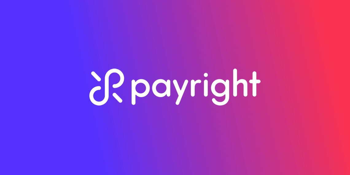
PayrightLogo + Visual Identity + Campaign
HakoahVisual Identity

DeputyVisual Identity + Illustration
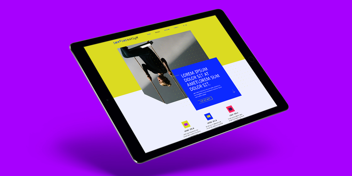
ImaginenationVisual Identity + Website
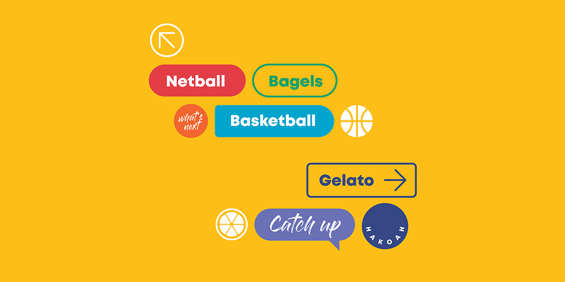
LogosLogotype & Logomark
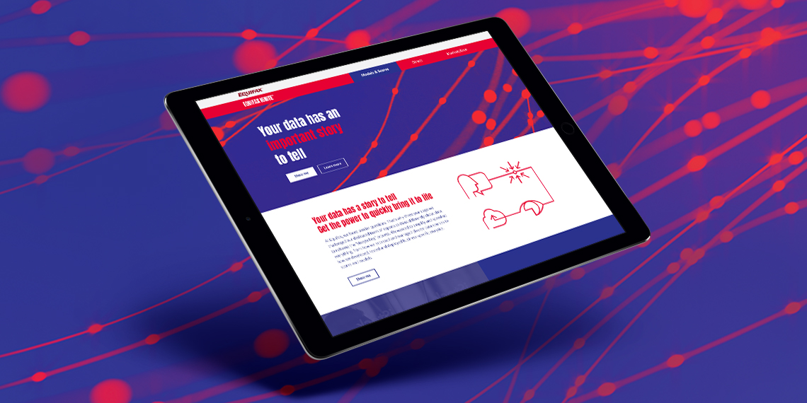
EquifaxWebsite, eDM, Visual Identity, Print

Vero – Qantas Business RewardsMini campaign

Vero - UI KitUI Kit
TargusWebsite improvement

Vero – Risk Profiler ToolIconography, Digital Online Tool
All content © of the design agency and respective brands 2017-2020.